Common Space
Strategic Systems
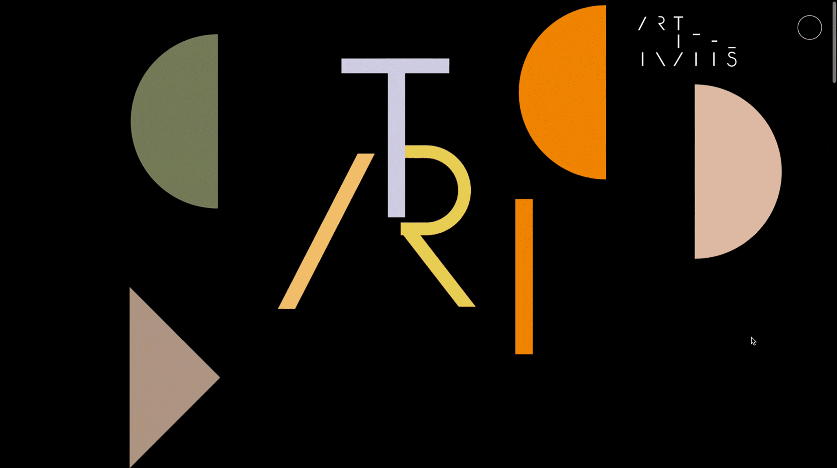
Visual Language
Creative Direction

What happens when ornament scales up to architecture?

A large-scale screen-printed pattern designed for the exterior of Harry Winston’s flagship boutique in Shanghai. The design references verre églomisé, expanding an intimate, gilded technique into an 11,000-square-foot façade. A study in scale, material translation, and surface as a site of meaning.
View ProjectView Project
How do you make a property’s history feel tangible?

We took cues from the building’s intricate details, pairing them with archival imagery to craft a brochure that feels like a rare artifact. Part real estate listing, part design object. The result? A publication that resists nostalgia, instead operating as a material document where archival imagery and contemporary design thinking intersect to produce a study in continuity and change.
View ProjectView Project
How do you translate the inherent, time-honed character of MAST where every artisan embodies a distinct desert narrative, into a visual identity?

Through logo hits, a new website, and art-directed photo campaigns, we distilled MAST’s spirit into visuals that speak with quiet confidence, capturing the lived-in essence and storied history of the community.
View ProjectView Project
What do you do when Werner Herzog asks you to design his Whitney Biennial installation?

We designed the exhibition layout, video edit, video configuration and soundtrack. By amplifying close-ups of Hercules Segers’ landscape etchings and pairing them with Ernst Reijseger’s evocative score, we designed a shifting, scroll-like visual narrative that redefines the art of storytelling.
View ProjectView Project
Can a visual identity embody mutation, rather than simply depict it?

We designed a typographic system that behaves like a living organism: shifting, mutating, and resisting stasis. The website and printed materials mirror this ethos, allowing for continual evolution. In a world of unstable paradigms, the only viable aesthetic strategy is one of adaptation.
View ProjectView Project
How do you create a restaurant brand that isn’t just a name, but a cultural institution?
From The Dutch to The Breslin, our work helped define an era of dining in New York City, setting visual and experiential standards that shaped the industry. These identities weren’t just aesthetics.. they established a sense of place, storytelling, and lasting cultural resonance.
View ProjectView Project
How can an art fair’s identity reflect the layered histories of its host city?

Our campaign examines LA as a site of transformation. Minimalist gradients and mirrored performers capture the interplay of art, commerce, and reinvention: holding space for both mythology and critique. A campaign that doesn’t just represent the fair, but questions its place within the city’s shifting cultural landscape.
View ProjectView Project
How do you create a visual identity that embraces complexity rather than simplifies it?

We reimagined the slash ( / ) typically a mark of division as a connective tissue, a structural element that embodies IDA’s role in bridging perspectives. The identity and website function as an adaptable framework, capable of holding multiplicity without dilution.
View ProjectView Project
How do you build a real estate brand that is more about place than property?

Our response was to deveop a visual identity that captures the essence of Upstate Curious. Bold yet refined, rooted yet expansive. The interplay of the “U” and “C” forms a mark that is both emblematic and open-ended, much like the brokerage itself: a conduit for discovery, deep local knowledge, and an ever-evolving community. This is not just about buying and selling property; it’s about shaping the cultural landscape of the Hudson Valley.
View ProjectView Project
How do you visualize craftsmanship in motion?

An animation that distills the luminosity, precision, and tactility of Tiffany & Co. into motion.. where heritage and innovation converge in a sequence as refined as the objects it represents.
View ProjectView Project
How do you create a brand for a figure who resists categorization?
Rather than reducing Artemis Baltoyanni to a singular role, the identity holds space for the full spectrum of her practice: curator, gallerist, strategist. A framework designed for evolution, just like her work. A visual system that accommodates both expertise and experimentation, allowing Baltoyanni’s work to move seamlessly between roles. The result is an identity that operates with the same adaptability as the career it represents.
View ProjectView Project